Every social clip in Mato starts from a template that controls its visual structure: how captions appear, where b-roll sits, and what animations play. After generation, you can customize colors, fonts, caption positioning, and effects in the clip editor before rendering. This guide covers how to pick the right template, adjust its style, and preview the result.
Choose a template during clip creation
When you create a new batch of social clips (from an episode or a text prompt), the configuration step shows a grid of template cards.
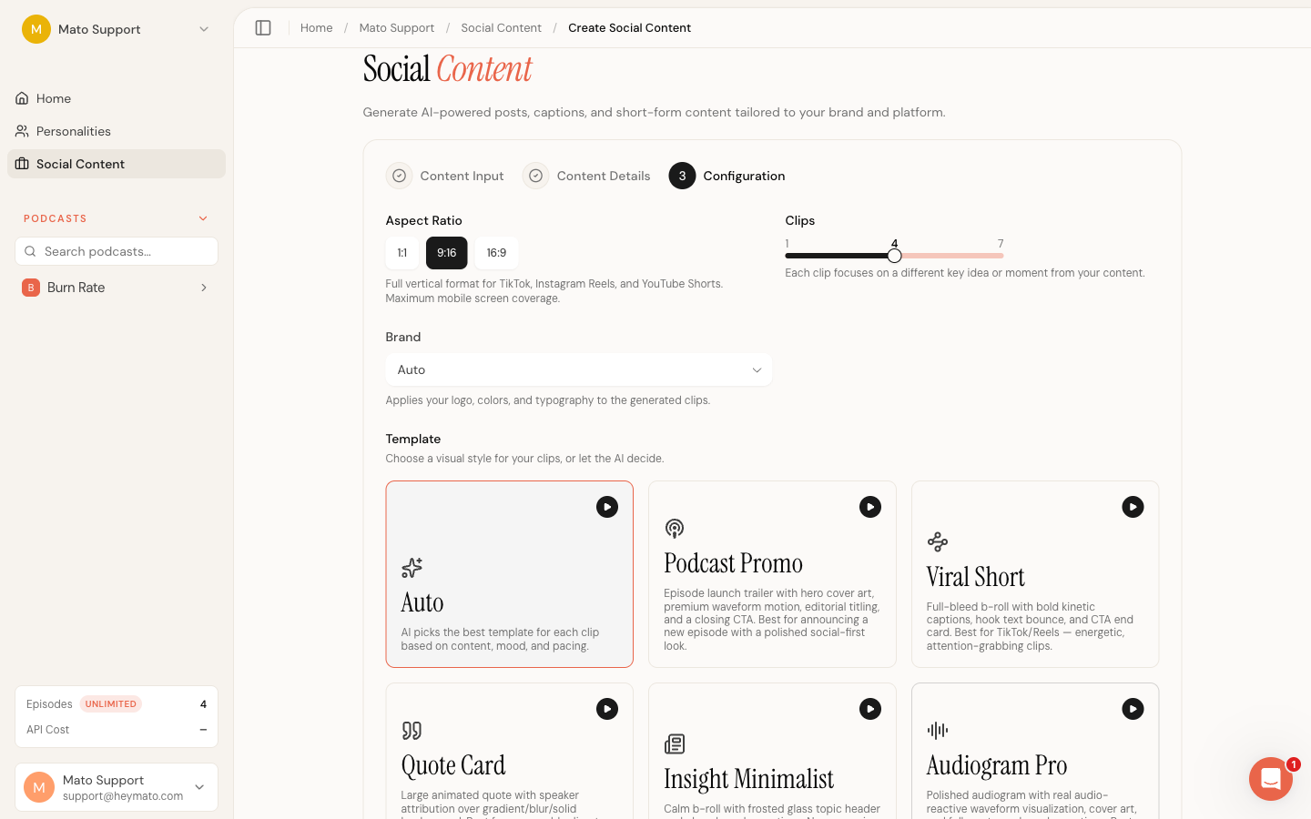
Each card shows the template name, an icon, and a short description of what it does best. Click a card to lock all clips in the batch to that template. Click it again to switch back to Auto, which lets the AI pick the best template for each clip based on content, mood, and pacing.
The seven templates are:
| Template | Best for | Visual style |
|---|---|---|
| Podcast Promo | Announcing a new episode | Cover art, waveform motion, editorial title, closing CTA |
| Viral Short | TikTok and Reels | Full-bleed b-roll, bold kinetic captions, hook text, end card |
| Quote Card | Memorable quotes and sound bites | Large animated quote with speaker attribution over a styled background |
| Insight Minimalist | LinkedIn and B2B thought leadership | Calm b-roll, frosted glass topic header, clean karaoke captions |
| Audiogram Pro | Audio-first or music-driven content | Audio-reactive waveform, cover art, full-sentence karaoke |
| Cliffhanger Teaser | Driving listeners to the full episode | Suspenseful b-roll, progress indicator, curiosity-gap text |
| UGC Style | Authentic user-generated feel | Split-screen b-roll, picture-in-picture, independent zoom per panel |
Set the aspect ratio
Next to the template selector, you choose one or more aspect ratios for the batch:
| Ratio | Platforms | Format |
|---|---|---|
| 9:16 | TikTok, Instagram Reels, YouTube Shorts | Vertical, full mobile screen |
| 1:1 | Instagram feed, LinkedIn | Square |
| 16:9 | YouTube, Twitter/X, LinkedIn video | Landscape, desktop-oriented |
You can select multiple ratios. When you do, the AI distributes them across clips so every selected format is represented. At least one ratio must be selected.
The aspect ratio affects how each template renders. Vertical (9:16) clips get the most screen real estate for captions and hook text. Square (1:1) clips compress the layout and reduce caption font sizes slightly. Landscape (16:9) clips shift captions lower and give more room to cover art or b-roll.
Open the clip editor
After your clips are generated, click any clip thumbnail in the batch view to open the integrated editor. The editor has two main areas: a live video preview on the left and a style panel on the right.
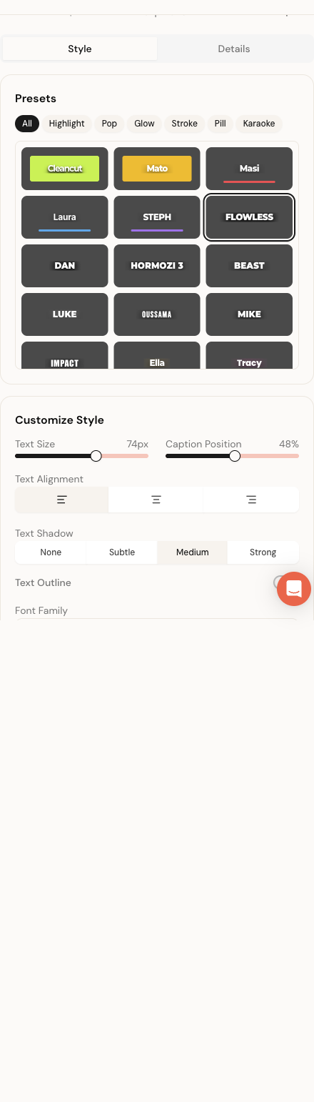
The style panel has two tabs: Style and Details. All visual customization happens in the Style tab.
Pick a caption style preset
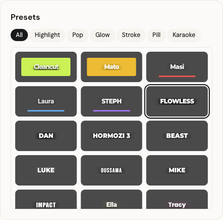
The Style tab opens with a Presets card at the top. This card contains the caption style grid, which shows 30+ text style presets grouped into six families: Highlight, Pop, Glow, Stroke, Pill, and Karaoke.
Each preset card shows a mini preview of how captions will look, with the preset's font weight, text transform, shadow, and accent color applied. Click a preset to apply it. The video preview updates immediately so you can see the result without saving.
Use the filter tabs above the grid to narrow the list. For example, click Pill to see only presets with rounded pill-shaped caption backgrounds. Click All to show the full list again.
Some templates also show a template-specific preset grid above the caption presets. Quote Card has five presets (Editorial, Bold, Tweet, Minimal, Neon). Insight Minimalist has four (Clean, Corporate, Warm, Dark). Cliffhanger Teaser has four (Suspense, Countdown, Cinematic, Subtle). These control the template's overall visual mood, not just the captions.
Customize caption appearance
Below the Presets card, the Customize Style card gives you fine-grained control over how captions look and behave.
Text size and caption position
Two sliders sit side by side at the top. Text Size controls the caption font size (32px to 100px). Caption Position controls where captions sit vertically in the frame, from near the top to near the bottom. The current pixel values display next to each slider.
Text alignment
Three icon buttons (left, center, right) control how caption text aligns horizontally. Center is the default for most templates.
Text shadow
Four toggle buttons (None, Subtle, Medium, Strong) control the drop shadow behind caption text. Stronger shadows improve readability over bright or busy b-roll.
Text outline
A toggle switch enables or disables a text outline (stroke). When enabled, a Stroke Width slider appears underneath, adjustable from 1px to 12px. Outlines use the Primary Color you set in the color pickers below.
Font family
A dropdown lists all available fonts, grouped into four categories: Sans Serif, Display, Serif, and Monospace. The dropdown preview shows each font name rendered in its own typeface so you can see what you are choosing.
Available fonts include Inter, DM Sans, Poppins, Montserrat, Roboto, Open Sans, Lato, Nunito, Rubik, Raleway, Work Sans, Manrope, Space Grotesk, Plus Jakarta Sans, Sora, Kanit, Oswald, Bebas Neue, Barlow Condensed, Outfit, Playfair Display, Merriweather, Instrument Serif, Source Serif 4, and JetBrains Mono.
Changing the font affects both captions and title/hook text across the clip.
Override colors
The color picker grid sits below the font dropdown. Up to eight color swatches appear depending on the template:
| Color | What it controls | Shown for |
|---|---|---|
| Text Color | Caption text (inactive/non-highlighted words) | All templates |
| Accent Color | Decorative elements like waveform bars, borders, gradient tints | All templates |
| Active Text | The currently spoken word in captions | All templates |
| Highlight | Background or effect color behind the active word | All templates |
| Primary Color | Text outline stroke color and template accents | All templates |
| Background | Template background color | Templates with a solid or gradient background |
| Hook Bg | Hook text phase background | Viral Short |
| Hook Text | Hook text color | Viral Short |
| Quote Text | Quote text color | Quote Card |
| Author Text | Speaker attribution text color | Quote Card |
| Gradient | Secondary gradient color | Audiogram Pro (cover art layout) |
| Header Text | Header bar text color | Audiogram Pro |
Click any color swatch to open the browser's native color picker. The hex value displays inside each swatch. Changes apply to the preview immediately.
Fine-tune title and hook text
A Fine-tune section appears below the color pickers. It has three controls:
- Title Size: a slider (60px to 120px) that adjusts the hook/title text size independently of caption size
- Title Weight: a slider (400 to 900) that controls how bold the title text renders
- Uppercase: a toggle that forces title text to uppercase
These override the defaults set by the active preset. The current default values (from the preset) show as the slider starting positions, so you can see what the preset chose before adjusting.
Template-specific controls
Some templates expose additional controls that only appear when that template is active.
Quote Card
A Background Style picker with three options: Gradient, Blur, and Solid. Gradient creates a color sweep behind the quote. Blur uses a blurred version of the podcast cover art. Solid fills the background with the Background color from the color grid.
Cliffhanger Teaser
A Progress Style picker with two options: Ring and Bar. Ring shows a circular countdown timer. Bar shows a horizontal progress bar at the bottom of the frame.
Audiogram Pro
Three additional controls appear:
- Layout Mode toggles between Cover Art (classic audiogram with cover image and waveform) and Typography (text-driven layout)
- Show Header toggles the header bar with episode title and branding (only visible in Typography mode)
- Text Alignment controls left, center, or right alignment for the Typography layout
Adjust video effects
Templates that use b-roll (Viral Short, Insight Minimalist, Cliffhanger Teaser, UGC Style) show a Video Effects section separated by a divider at the bottom of the style panel.
Smooth transitions
A toggle that enables animated transitions between b-roll segments. When off, clips use a simple cross-dissolve between shots.
Emoji reactions
A toggle that shows or hides animated emoji reactions at specific timestamps throughout the clip. These are generated by the AI during clip creation.
Light leaks
A toggle that enables cinematic light leak overlays at b-roll transitions. When enabled, two additional sliders appear:
- Intensity: controls the opacity of the light leak effect (10% to 80%)
- Hue: shifts the color of the light leak effect (0 to 360 degrees)
Hook animation
Six animation styles for how hook/title text enters the frame: Bounce, Blur Slide, Cascade, Glitch, Word Pop, and Fade Up. Click any style button to switch. The preview updates immediately.
Animated background
A toggle that enables animated gradient backgrounds. When enabled, three color pickers appear (Start, Middle, End) to control the gradient colors that the background transitions through over the duration of the clip.
Preview your changes
Every change you make in the style panel updates the video preview immediately. No save is needed to see the result.
The preview area shows a live Remotion player at the top. A transport bar below it lets you play, pause, and scrub through the clip. In the top-right corner of the preview, a toggle switches between two modes:
- Phone mode: wraps the preview in a simulated phone frame with a TikTok-style overlay (username, like/comment/share icons). This shows how the clip will look on a mobile feed.
- Plain mode: shows the raw video without any overlay.
Use Phone mode to check whether captions are readable over the simulated UI elements. Important text should not be hidden behind the like or share buttons.
Save or reset
At the bottom of the Customize Style card, two buttons appear:
- Reset discards all unsaved changes and returns the style to its last saved state. This button is disabled when there are no changes.
- Save style writes your changes to the database. After saving, the preview reflects the saved state. If you later render the clip, it uses the saved style.
Both buttons are disabled while a save is in progress. A spinner and "Saving..." label replace the Save button text during the operation.
You can navigate between clips in the batch using the Previous and Next buttons at the top of the style panel. A "Clip 2 of 5" indicator shows your position. Style changes for each clip are independent. Saving one clip does not affect the others.
What to do next
Once you are happy with the style, switch to the Details tab to review the clip's script, hook text, and metadata. From there you can render the clip or publish it directly to your connected platforms.