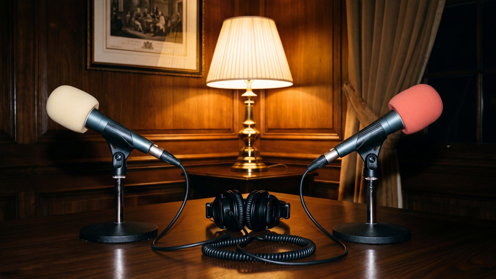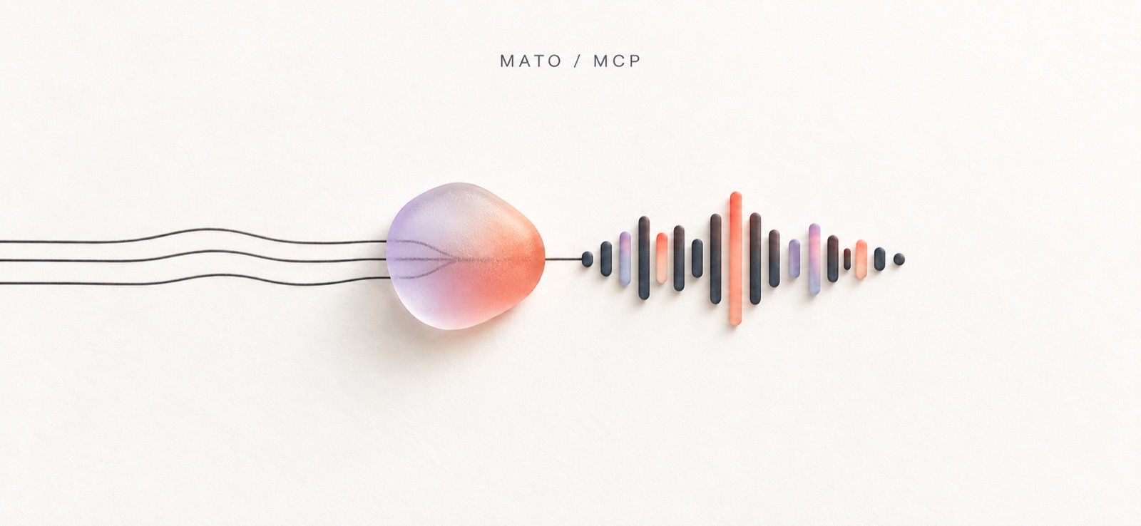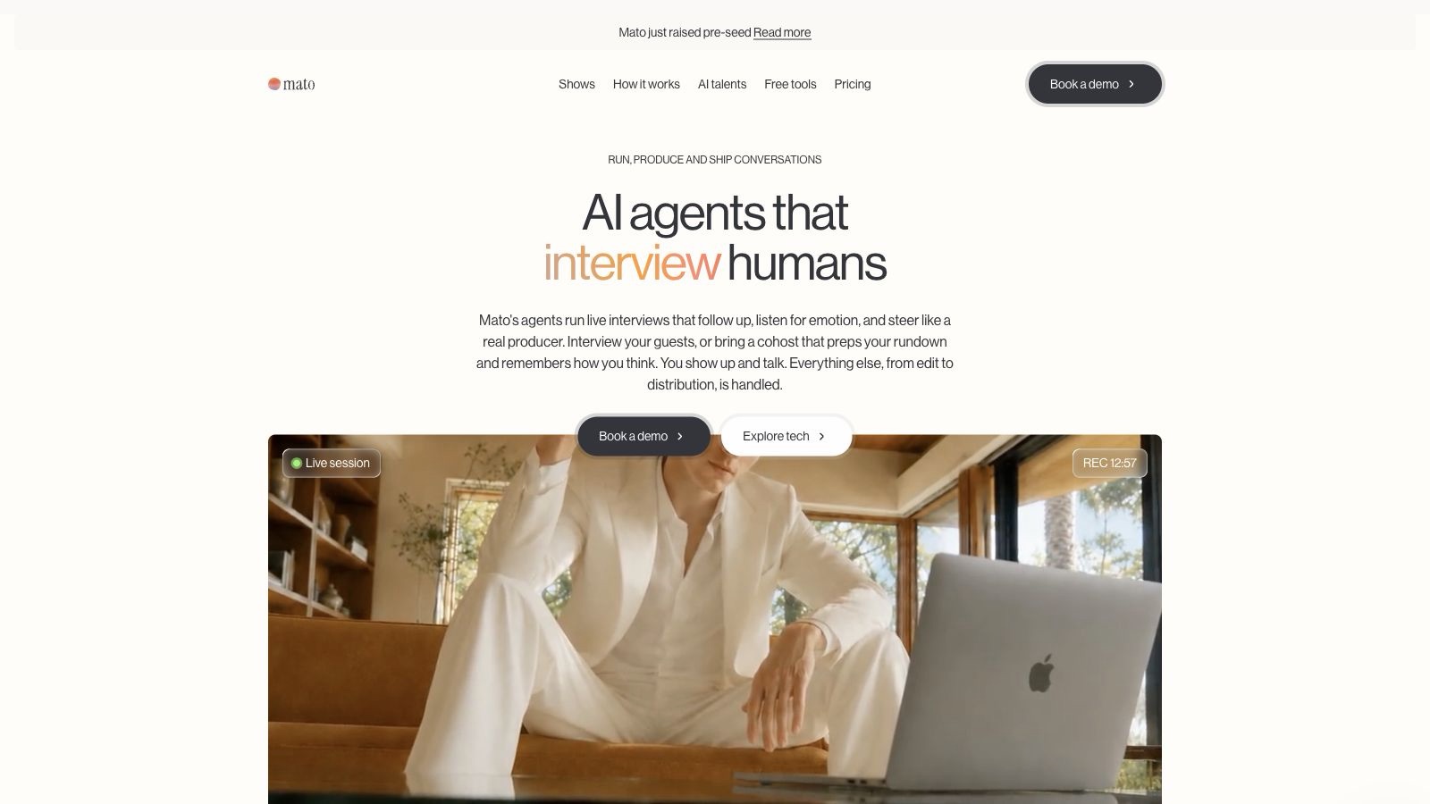
Mato has a new face. The website, logo, portraits, and visual system are live.
We started with one question: what should technology look like when its job is to make another person more present?
Our agents prepare for interviews, listen closely, and stay with an unfinished thought long enough for it to become useful. Podcasting is where that work began. The same interviewing engine can capture knowledge that would otherwise stay inside a person's head.
What comes before the words
The clearest line on the new site lives on our vision page: “Most of what people know, they've never said out loud.”
That sentence became the brief. The site needed room for hesitation and memory, especially the second answer that arrives after the obvious one. It could not feel like software congratulating itself.
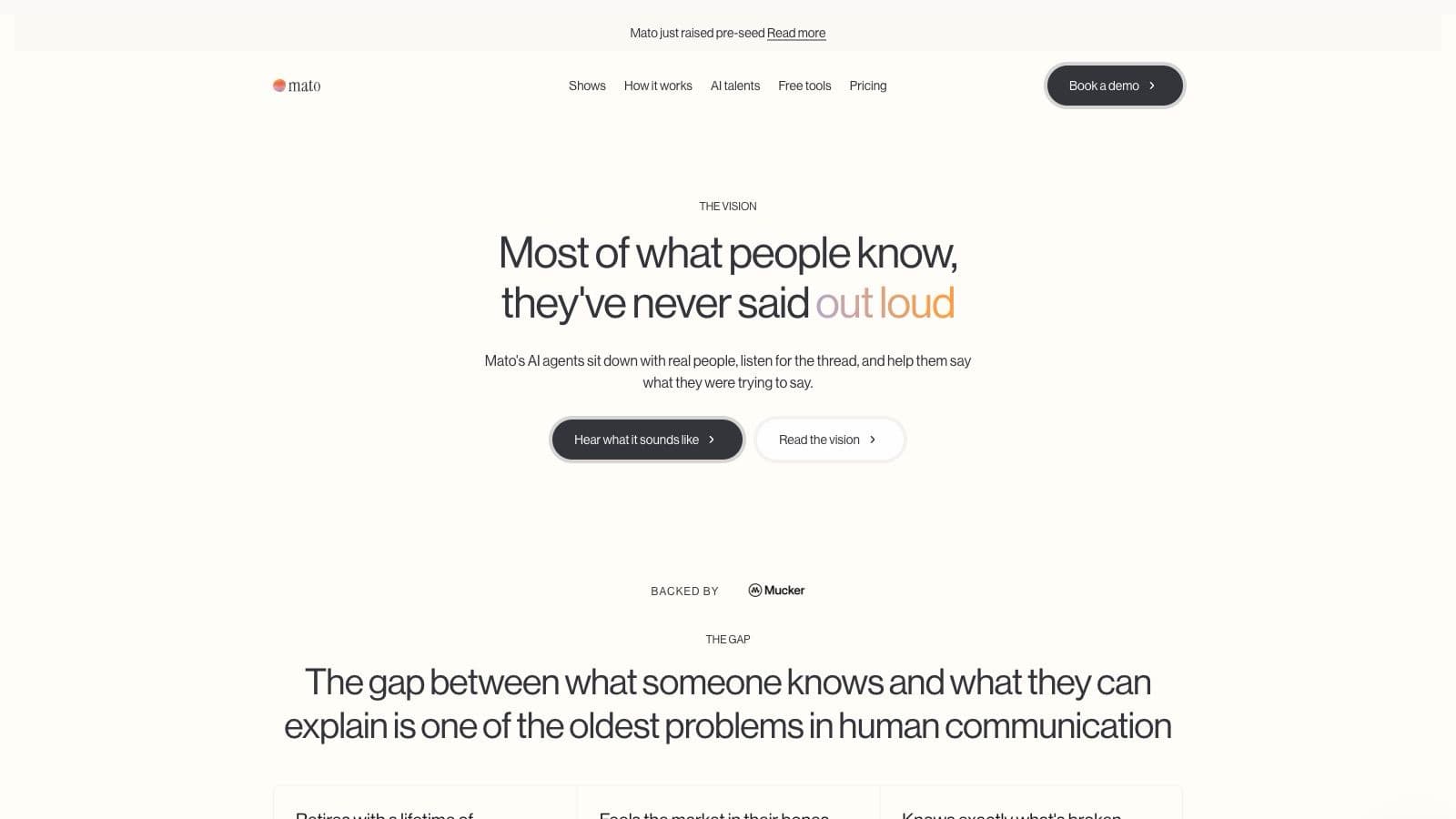
Warm white gives the pages the feeling of paper without turning nostalgic. Graphite is softer than pure black. Neue Haas Grotesk brings order to product detail, then gets out of the way. Space is doing as much work as type. One thought lands before the next one begins.
Color is held back until something human happens. It enters on “interview,” “finished episode,” and “out loud.” The gradient does not decorate the software. It marks the moment a thought crosses into the world.
A mark that never quite settles
The new Mato mark has a calm wordmark and a restless center.
The lowercase letters have the character of a masthead or a signature. Beside them, the blob moves. Warm orange and coral drift into lilac and blue. Its outline changes on a separate rhythm, so the color and shape rarely return to the same frame at the same time.
The wordmark gives us consistency; the moving field leaves room for surprise. The system around a conversation should be dependable. The conversation itself should stay open enough to change direction.
Static versions of the mark still belong on documents, social images, and places where motion is unavailable. On the website, it is allowed to breathe.
The interface steps aside
The homepage puts a person in the largest frame. Product controls sit above the film as translucent labels, fine borders, and small pieces of evidence: a live session, a recording state, the presence of an agent.
Glass works here because there is something worth seeing behind it. The interface remains legible without becoming the subject. Even the darkest buttons keep their color hidden until the visitor moves toward them.
It reads like an editorial film, with Mato present but never between the viewer and the person speaking.
Presence before performance
The AI talent library turns that restraint into portraiture.
Each talent has a room, a posture, a wardrobe, and a point of view. A bookshelf behind Derek Wu suggests a different interviewing temperament than a bright studio or a sparse office. The setting begins the introduction before a biography has to explain it.
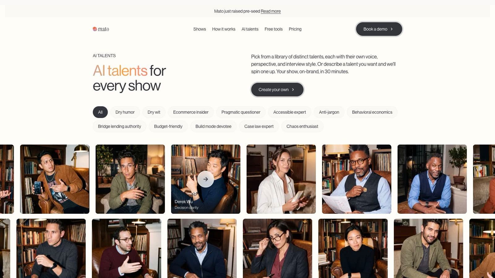
Inside the library, the portraits move only when the visitor asks. On a fine pointer or keyboard focus, an approved five-second silent clip crosses over the still. It rewinds when the interaction ends. Only one preview plays at a time, and reduced-motion preferences leave the portrait untouched.
The motion is quiet. Derek shifts his gaze and raises a hand as if the next question has just occurred to him. That is enough. Presence comes from attention, not spectacle.
Work has a rhythm
Products like Mato are often described as pipelines. The word is accurate and emotionally dead. People experience the work as a sequence of moments: invite someone, prepare the conversation, listen, review, decide what deserves to travel further.
The new How It Works page treats those moments as scenes. One film opens wide. Two sit beside it like vertical frames on a contact sheet. The composition gives the workflow a pace before the copy begins to explain it.
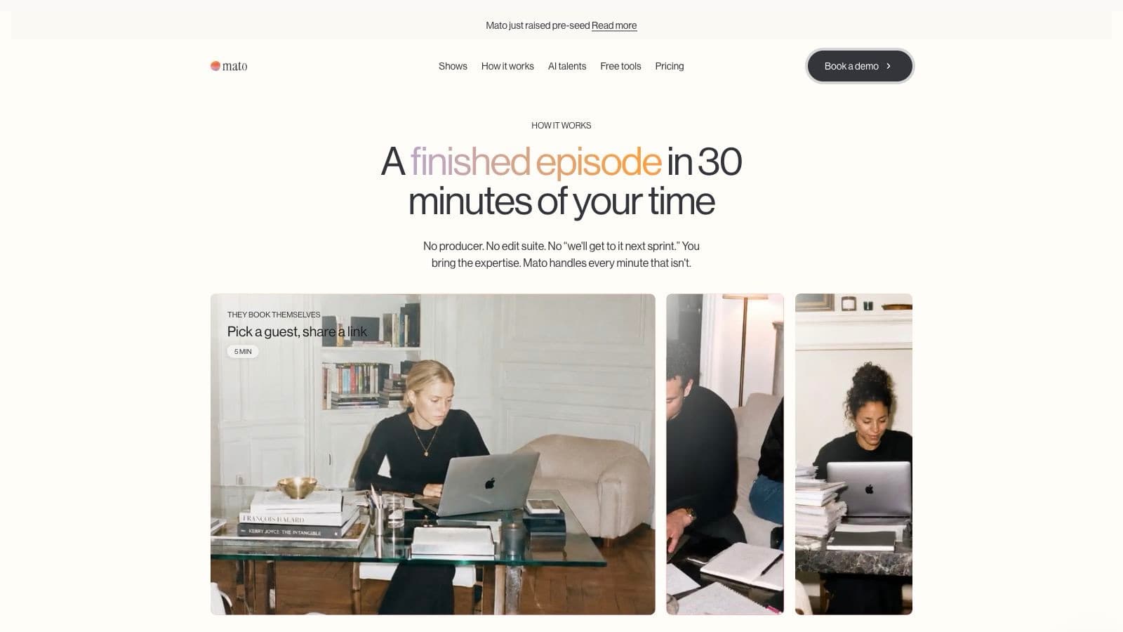
The visible 5, 10, and 15-minute marks keep the films connected to work. Atmosphere matters, but so does the promise that the process can fit inside a real day.
Room for a larger idea
The system now holds a homepage, show pages, talent profiles, pricing, long articles, public tools, and documentation without forcing every surface into the same layout.
We need that range because podcasting remains Mato's first home, while an interview engine can serve many kinds of knowledge: customer conversations, expert capture, research, oral history, and the useful detail that only appears when someone asks one more question.
The previous brand described a podcast product. The new one has room for a company built around human knowledge.
A promise the product has to keep
A public brand is a promise. The working product has to keep it.
We are now designing a unified experience for the Mato backend. That work is in progress. We want content-focused work to feel easier to read and move through.
Planning, interviews, editing, clips, publishing, and measurement should feel like one continuity rather than a collection of tools connected by navigation. The content should own the screen. Controls should appear beside the decision they affect. A producer should know what is ready, what needs attention, and what comes next without first translating the interface.
The backend will always be denser than the public site. It has more states, more collaboration, and more consequences. Even there, technology belongs around the conversation, never in front of it.
The website makes the direction visible. Now each hour inside Mato has to live up to it: human material in the center, with the system helping it become worth sharing.
The new Mato is live
See the brand in motion, then read where the product is going.
Explore the site, meet the talent library, and read our vision for interview-led work.